Key takeaways
MOBILE APP

Designed & implemented new telematics mobile app

Designed & implemented new telematics mobile app

ROLE
ROLE

UX/UI Designer - Product Design

UX/UI Designer - Product Design

UX/UI Designer - Product Design

EXPERTISE
EXPERTISE

UX/UI Design

UX/UI Design

YEAR
YEAR

2025

2025

Project description

Project description

COMPANY

Based on feedback collected from multiple clients, the goal was to fully redesign the Blend+ mobile application, a fleet management tool used to track equipment, locations and operations across construction and industrial sites.

GOAL

Completely rethink the mobile experience to improve usability, streamline key workflows and deliver a faster, more intuitive interface aligned with how teams actually work in the field.

TIMELINE

From explorations to final designs in 1 year and half, while working on multiple parallel projects.

Process

Process

Four phases, each shaped by real user feedback and tight collaboration with product, development and key clients. Here's how the redesign came together.

Four phases, each shaped by real user feedback and tight collaboration with product, development and key clients. Here's how the redesign came together.

01 - research
User & market research

Understanding pain points before touching pixels.

We started by collecting feedback from existing clients to identify the main pain points of the previous app, then clustered insights into recurring themes. In parallel, we partnered with a key client in Thailand to study the main local competitor, a government-funded app, gaining a clearer picture of market standards and user expectations.

User interviews

Competitor analysis

Insight clustering

02- ux
Wireframes & architecture

From insights to structured solutions.

With research in hand, we moved into wireframing, rethinking core sections and optimizing flows for a faster, more intuitive experience. We redefined the information architecture using Google Analytics data to prioritize the most-used features. After iterating with product and project managers, we finalized the structure and moved to visual design.

Wireframing

IA DESIGN

DATA DRIVEN DECISIONS

03 - UI
Visual design & system

A design system built for scale and Flutter.

After aligning with the dev team on the Flutter framework, we explored Material Design components to ensure feasibility and consistency. We built a dedicated mobile design system balancing standard components with custom elements for a distinctive identity, fully documented in Figma as a shared library for efficient design, dev collaboration.

Design system

Figma Library

Flutter/Material

04 - qa
Testing & iteration

Catching issues before users did.

Once designs were handed off, we moved into a dedicated testing environment to review the app as it was being developed. Bugs and inconsistencies were tracked in Jira with clear documentation, current behavior, supporting screenshots or videos, expected outcome, and resolved through regular follow-ups with the development team.

QA testing

Jira

Dev sync

Seven principles
that guided the redesign.

Seven principles
that guided the redesign.

Each section of the app was introduced through a dedicated motto, concise statements that captured the design intention and the value delivered to users. They guided every decision, from architecture to micro-interactions.

Each section of the app was introduced through a dedicated motto, concise statements that captured the design intention and the value delivered to users. They guided every decision, from architecture to micro-interactions.

01
Tap the map / Rule the site

Track the location of all assets across sites with an intuitive, interactive map view.

02
Your fleet / one map / zero doubts

Quickly locate and identify machines by ID or model with powerful search and filtering tools.

03
Find it fast / move even faster

Visualize equipment down to street level with satellite view and real-time location tracking.

04
Draw a line / define control

Create and manage geofences to monitor unauthorized movements and improve operational control.
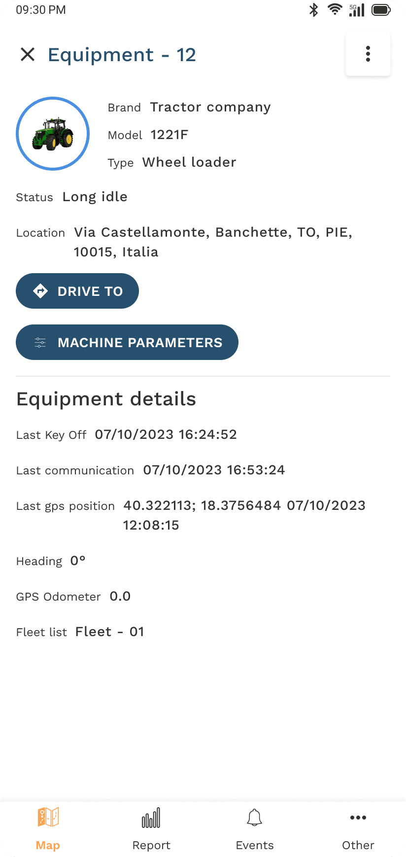
05
All system go / All in one screen

Access equipment details, usage data, location history and diagnostic parameters — all in one place.

Access equipment details, usage data, location history and diagnostic parameters, all in one place.

06
Less fuel / more facts

View detailed CAN data reports to monitor additive flow, fuel use and performance metrics over time.

07
Stay alert / stay ahead

Receive instant notifications on low fuel, curfew violations and system warnings to act fast.

Results

Results

A completely reimagined mobile experience that earned positive feedback from clients, improved usability across critical workflows and set a scalable design foundation for future features.

A completely reimagined mobile experience that earned positive feedback from clients, improved usability across critical workflows and set a scalable design foundation for future features.

Faster workflows

Key flows streamlined based on real usage data, reducing time-to-task across the most-used sections.

Positive client reception

High satisfaction across pilot clients, with feedback confirming the new flows matched real field operations.

Scalable foundation

A documented design system in Figma now powers ongoing feature development with consistency.

Key takeaways

Working with field-deployed users showed that small frictions compound into big productivity losses — and that a focused design system pays back in every sprint that follows. Pairing UX research with live analytics data from the start kept every decision grounded in evidence rather than opinion.

Working with field-deployed users showed that small frictions compound into big productivity losses — and that a focused design system pays back in every sprint that follows. Pairing UX research with live analytics data from the start kept every decision grounded in evidence rather than opinion.

Next project

Next project

Gazelle

Create a free website with Framer, the website builder loved by startups, designers and agencies.